Adobe Photoshop Color Balance: Pro Photo Editing Tutorial 2026,
Therefore, in professional photo editing, Color Balance is a fundamental adjustment used to shift the overall mixture of colors in an image. It is primarily used for color correction (removing unwanted color casts) or creative grading (adding a specific mood).

Adobe Photoshop Color Balance: Pro Photo Editing Tutorial 2026,
Therefore, unlike “Hue/Saturation,” which changes the color itself, Color Balance focuses on the complementary relationships between colors.
How Color Balance Works:
Therefore, the tool operates on the principle of the color wheel. By increasing one color, you simultaneously decrease its opposite.
| To increase… | You must decrease… |
| Red | Cyan |
| Green | Magenta |
| Blue | Yellow |
Adobe Photoshop Color Balance: Pro Photo Editing Tutorial 2026,
The Three Tonal Ranges:
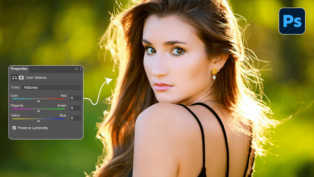
Therefore, in Photoshop’s Color Balance adjustment (found via Image > Adjustments > Color Balance or as an Adjustment Layer), you can target three specific areas:
- Shadows: Therefore, Affects the darkest parts of the image. Great for adding “cool” blues to dark areas.
- Midtones: Therefore, Affects the average exposure. This is usually where you’ll do the most correcting for skin tones.
- Highlights: Affects the brightest parts. Useful for warming up sunlight or “cleaning” white backgrounds.
Professional Workflow Tips:
1. Always Use Adjustment Layers:
In other words, never apply Color Balance directly to your image layer (Ctrl/Cmd + B). Instead, use the Adjustments Panel. This allows you to go back and tweak the sliders later without permanently damaging your pixels.
2. Preserve Luminosity:
In other words, there is a checkbox at the bottom of the Color Balance window labeled “Preserve Luminosity.” * Keep it checked: This ensures that shifting the colors doesn’t change the brightness of the image.
- Uncheck it: However, if you want the color shift to feel more “dense” or heavy, though this is rarely done in professional retouching.
Adobe Photoshop Color Balance: Pro Photo Editing Tutorial 2026,
3. Neutralizing a Color Cast:
In other words, if your photo looks too “orange” due to indoor lighting, you are dealing with an excess of Yellow and Red.
- However, slide the bottom slider toward Blue.
- Above all, slide the top slider toward Cyan.
4. Creative Color Grading:
However, to get that “Cinematic” look often seen in high-end photography:
- Above all, Add Blue/Cyan to the Shadows.
- However, Add Red/Yellow to the Highlights.
- Above all, this creates a “split tone” effect that adds depth and visual interest.
Adobe Photoshop Color Balance: Pro Photo Editing Tutorial 2026,
Pro Tip: Above all, If you’re struggling to see the color cast, temporarily boost the Saturation of the image to +50. The hidden color tints will become obvious, making it easier to know which sliders to move in Color Balance. Just remember to turn the saturation back down when you’re done!
Would you like me to walk you through how to use the Curves tool for even more precise color control?