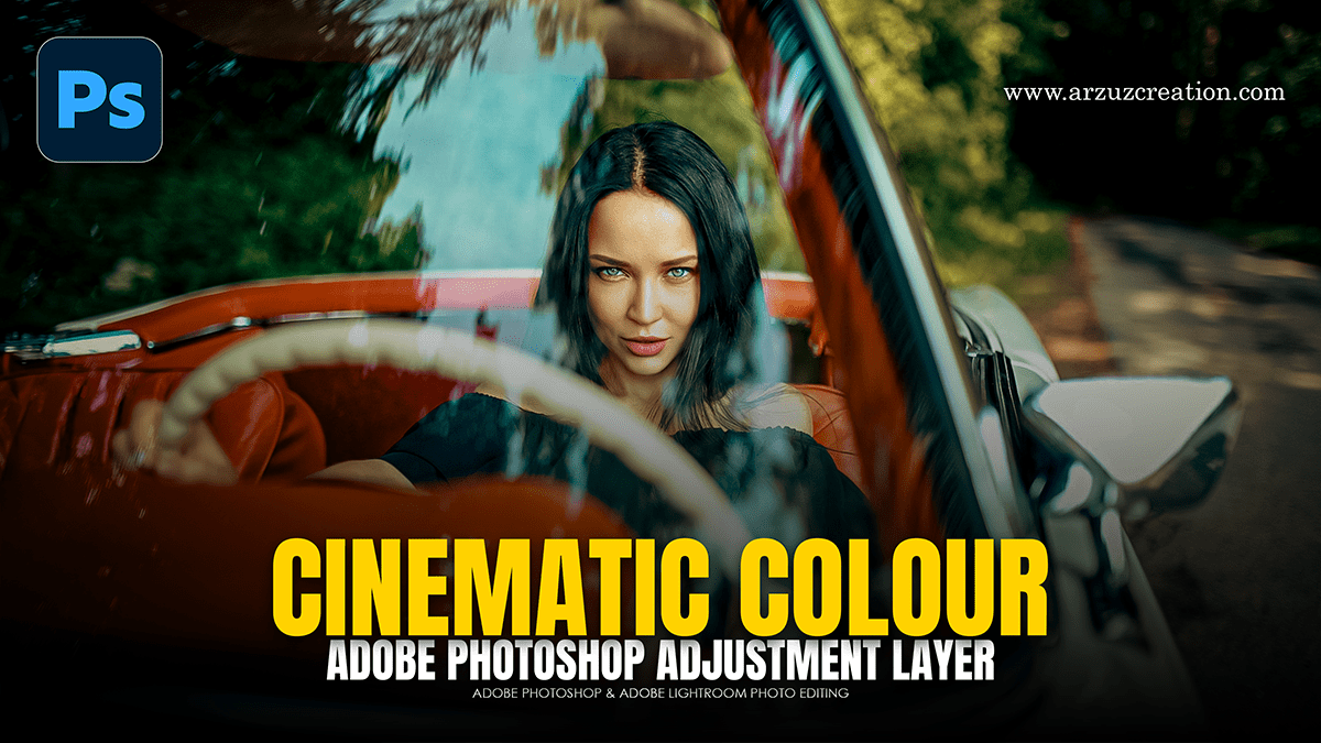
Cinematic Colour Grading: Levels and Adjustment Layer Photoshop

Therefore, creating a cinematic look in Photoshop using adjustment layers allows for a non-destructive workflow, meaning you can tweak the “grade” without permanently altering your original image.
In other words, here is a workflow to achieve a high-end, cinematic aesthetic:
Cinematic Colour Grading: Levels and Adjustment Layer Photoshop
1. Color Balance (The Foundation)
Therefore, Cinematic grading often relies on Complementary Color Theory, specifically the “Teal and Orange” look. This creates depth by pushing cool tones into shadows and warm tones into highlights.
Shadows: Move the sliders toward Cyan and Blue.
Highlights: In other words, move the sliders toward Red and Yellow.
Midtones: Therefore, adjust slightly to bridge the gap, usually leaning toward a subtle warmth to keep skin tones natural.
2. Curves (The “Log” Look)
In other words, to get that matte, filmic texture, you need to manipulate the “black point” of the image.
However, create a Curves adjustment layer.
Therefore, pick the bottom-left point (pure black) and drag it slightly upward. This “crushes” the blacks into a dark gray, giving the shadows a faded, cinematic feel.
In other words, create an “S-Curve” by adding a point in the shadows and dragging down, and a point in the highlights and dragging up to maintain contrast.
Cinematic Colour Grading: Levels and Adjustment Layer Photoshop

3. Color Lookup (LUTs)
In other words, Photoshop has built-in Color Lookup (LUT) tables that emulate specific film stocks.
However, select Color Lookup from the Adjustment panel.
For instance, Try presets like “Crisp_Warm.look”, “Kodak 5218”, or “Fuji F125”.
Pro Tip: Always lower the Opacity of this layer to 30–50% so the effect doesn’t look “over-processed.”
4. Selective Color (Skin Tone Preservation)
However, if your teal-and-orange grade makes people look like Oompa-Loompas, use Selective Color.
For instance, choose Reds or Yellows from the dropdown menu.
However, decrease the Cyan to bring warmth back to the skin, or adjust Magenta to fix redness.
Above all, this ensures the environment is graded while the subjects remain grounded.
Cinematic Colour Grading: Levels and Adjustment Layer Photoshop
5. Gradient Map (Atmospheric Tint)
Above all, for a heavy stylistic “wash” (like the green tint in The Matrix or the blue in Ozark):
Similarly, Create a Gradient Map.
For instance, set the left color (shadows) to a deep navy or forest green and the right color (highlights) to a pale cream or light blue.
Above all, change the Blending Mode to Soft Light or Overlay and drop the opacity to 10–20%.
Final Touches
Vignette: For instance, use a subtle Brightness/Contrast layer with an inverted radial mask to draw the eye to the center.
Film Grain: Above all, while not an adjustment layer, adding a 50% gray layer set to Overlay with a Noise filter can replicate the organic texture of 35mm film.
In conclusion, would you like to dive deeper into a specific genre’s color palette, like “Noir” or “Cyberpunk”?
