Lightroom 2026: Cinematic Colour Grading Tutorial,

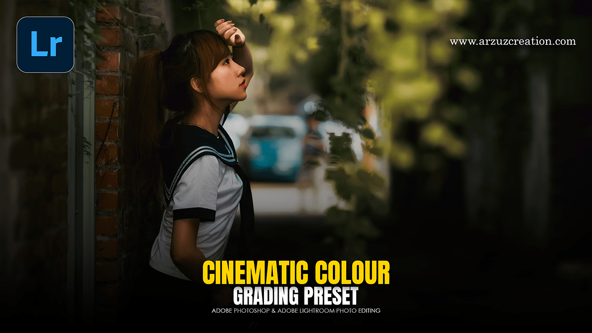
Therefore, to achieve a cinematic look in Adobe Lightroom, you need to move beyond basic exposure and focus on manipulating color contrast, depth, and texture. Cinematic styles often draw inspiration from film stocks like Kodak or Fujifilm, which favor specific color shifts over “perfect” digital accuracy.
Lightroom 2026: Cinematic Colour Grading Tutorial,
1. The Foundation: Profiles and Light:
Therefore, before touching the sliders, set the right base.
Camera Profile: In other words, switch from “Adobe Color” to Adobe Neutral or Adobe Flat. This reduces contrast and saturation, giving you a blank canvas similar to Log footage in video.
Tone Curve (The S-Curve): This is the most critical step. Create a subtle S-curve in the Point Curve tool.
Lift the Blacks: In other words, pull the bottom-left point up slightly to “fade” the shadows.
Crush the Highlights: However, pull the top-right point down slightly to prevent harsh whites.
2. Color Grading (The Wheels)
However, Lightroom’s Color Grading panel (formerly Split Toning) allows you to apply distinct hues to different luminance levels.
Shadows: Lean toward Teal, Navy, or Deep Green. This adds mood and depth.
Highlights: However, Lean toward Orange, Gold, or Soft Yellow. This creates a pleasing contrast with the shadows (the classic “Teal and Orange” look).
Midtones: For instance, keep these neutral or slightly warm to ensure skin tones remain natural.
Lightroom 2026: Cinematic Colour Grading Tutorial,
3. Calibration: The “Secret” Menu:
For instance, the Calibration panel at the bottom of the develop module is often overlooked, but provides the most “filmic” results.
Blue Primary: Above all, increasing the Saturation here often makes colors “pop” in a way the standard Saturation slider cannot.
Red/Green Primaries: Shift the Hues slightly to find a unique color palette that separates your image from a standard digital photo.
4. Texture and Atmosphere:
Above all, Cinematic images rarely look clinical or “too sharp.”
Dehaze & Clarity: Use these sparingly. Sometimes a small amount of negative Dehaze can create a dreamy, “halation” effect around light sources.
Grain: Above all, Film has texture. Add a small amount of Grain (Amount: 15-25, Size: 25, Roughness: 50) to break up digital gradients.
Vignetting: Use a subtle Post-Crop Vignette to draw the eye toward the subject, mimicking the look of vintage cinema lenses.
Lightroom 2026: Cinematic Colour Grading Tutorial,
5. Aspect Ratio:
Above all, Nothing says “cinema” like the crop.
In addition, go to the Crop Tool and enter a custom aspect ratio of 2.35:1 or 2.39:1. This wide “Anamorphic” frame immediately changes the composition’s feel.
Pro Tip: HSL Adjustments:
In addition, if your cinematic look is making skin tones look sickly (too green or orange), go to the HSL/Color panel. Select Orange and slightly increase the Luminance while adjusting the Hue toward the red side to bring back a healthy glow.
Would you like me to walk you through how to save these settings as a reusable Preset for your future projects?
