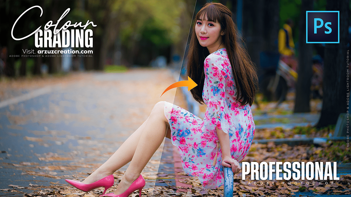
Professional Colour Grading Tutorial For Beginners 2025,
Therefore, that’s a great request! The Camera Raw Filter in Photoshop is an incredibly powerful tool for professional color grading, offering the same controls as Adobe Lightroom.

In other words, here is an overview of the key features and steps to achieve professional color grading using the Camera Raw Filter:
Professional Colour Grading Tutorial For Beginners 2025,
🎨 Professional Color Grading with Camera Raw Filter
Therefore, the best practice is to work non-destructively by converting your layer into a Smart Object first.
Step 1: Access the Camera Raw Filter
- Therefore, in Photoshop, ensure your image layer is selected.
- In other words, go to Filter > Convert for Smart Filters (if you haven’t already made it a Smart Object).
- Therefore, Go to Filter > Camera Raw Filter (Keyboard Shortcut: Ctrl+Shift+A or Cmd+Shift+A).
Professional Colour Grading Tutorial For Beginners 2025,
Method 2: Global Tone and Color Adjustments (The “Basic” Panel)
In other words, before grading, you need a strong base. Use the Basic panel (the first icon) to set the overall light and color:
- White Balance (Temp/Tint): Correct any color cast. You can use the eyedropper tool on a neutral gray or white area or manually adjust Temperature (blue/yellow) and Tint (green/magenta).
- Tone: In other words, adjust Exposure, Contrast, Highlights, Shadows, Whites, and Blacks to maximize dynamic range and detail. Holding Alt/Option while dragging the sliders helps you see where highlights/shadows are clipping.
- Presence: Use Clarity to enhance mid-tone contrast and Vibrance/Saturation to control color intensity.
Professional Colour Grading Tutorial For Beginners 2025,
Step 3: Precise Color Toning (The “Color Grading” Panel)
In other words, this is the core of professional color grading. Look for the Color Grading tab (it usually looks like a couple of color wheels). This replaces the older Split Toning panel and offers much more control:
- 3-Way Color Wheels: This is the default and most powerful view. It lets you apply a specific Hue and Saturation to three distinct tonal ranges:
- Shadows: Add a specific color to the dark areas (e.g., cool blue for a cinematic look).
- Midtones: Affect the middle tones (often left neutral, but useful for skin tones).
- Highlights: Add color to the bright areas (e.g., warm yellow/orange for sunlight).
- Luminance Slider: Below each wheel, use the Luminance slider to adjust the brightness of that specific tonal range.
- Blending: Adjusts how much the colors applied to the shadows, midtones, and highlights overlap. Lower values offer more separation.
- Balance: Shifts the balance of the overall color grade between the shadows (left) and highlights (right).
Pro Tip: In other words, A classic cinematic look is achieved by using a Cool color (blue/cyan) in the Shadows and a Warm color (yellow/orange) in the Highlights.
Professional Colour Grading Tutorial For Beginners 2025,
Method 4: Refined Color Control (The “Color Mixer” Panel)
However, this panel allows you to adjust specific colors in the image, perfect for isolating and fine-tuning elements like skin, foliage, or clothing.
- HSL (Hue, Saturation, Luminance) Sliders: Adjust the Hue, Saturation, or Luminance for individual colors (Reds, Oranges, Yellows, Greens, etc.).
- Example: To make the grass a richer green, select Greens and increase Saturation. To change the shade of the sky, select Blues and adjust the Hue.
- Example: To improve a subject’s skin tone (usually in the Oranges/Reds range), gently adjust the Hue and Saturation.
Step 5: Advanced Tonal Adjustments (The “Curves” Panel)
However, the Curve panel is essential for advanced contrast control and is used by pros to “finesse” the look established in the Basic panel.
- RGB Curve: Adjusts the overall luminosity and contrast of the image. An S-curve is common for adding contrast.
- Red, Green, and Blue Curves: Allows you to adjust the color contrast in specific tonal ranges.
- Example: To add blue to the shadows, select the Blue curve and pull the bottom point down (or the top point up for blue in the highlights).
Method 6: Effects and Detail
- Detail Panel: However, use the Noise Reduction and Sharpening sliders to refine the image quality.
- Effects Panel: Add Grain for a filmic look or use Vignetting to focus the viewer’s eye on the center of the image.
In conclusion, would you like a more detailed breakdown of a specific color grading style (e.g., cinematic, matte/faded, high-contrast fashion) using these tools?