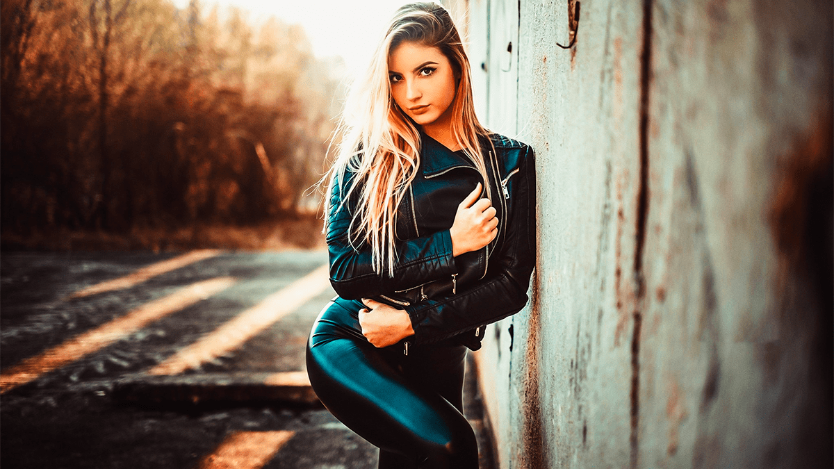
Photoshop Camera Raw Colour Grading Tutorial For Beginners,

Therefore, the Color Grading panel in Adobe Photoshop’s Camera Raw Filter (and Lightroom) is a powerful tool based on traditional digital intermediate wheels used in filmmaking. It allows you to introduce specific color tints into three distinct tonal ranges: Shadows, Midtones, and Highlights, as well as apply a global color tint.
In other words, here is a breakdown of how it works and how to use it effectively.
Photoshop Camera Raw Colour Grading Tutorial For Beginners,
The Core Controls: Three-Way Wheels:
Therefore, when you open the Color Grading panel, you will see three color wheels side-by-side (or one large wheel if you select the specific icons at the top of the panel to isolate Shadows, Midtones, or Highlights).
In other words, each wheel has three primary adjustments:
- Hue (The Outer Ring / Angle): Therefore, Dictates the color you are introducing. Moving the center point around the perimeter changes the color (e.g., pulling it toward teal or orange).
- Saturation (The Radius): In other words, Dictates the intensity of that color. The closer the point is to the center, the more subtle the effect. Pulling it toward the outer edge increases saturation.
- Luminance (The Slider Underneath): Controls the brightness of that specific tonal range. For example, dropping the luminance slider under the Shadows wheel will make your darks deeper.
Photoshop Camera Raw Colour Grading Tutorial For Beginners,
Advanced Adjustments: Blending and Balance:
In other words, at the bottom of the panel, you will find two crucial sliders that control how the three wheels interact with each other:
1. Blending
However, this determines how much the colors in the Shadows, Midtones, and Highlights overlap and mix.
- Low Blending (toward 0): Creates a strict separation between the colors you’ve added to the darks, mids, and brights.
- High Blending (toward 100): Smoothly transitions the colors into one another, creating a more cohesive, organic look.
2. Balance
However, this shifts the tonal thresholds defining what Photoshop considers a shadow, midtone, or highlight.
- Negative Balance (toward -100): Pushes the Shadow color adjustments further up into the midtones and highlights.
- Positive Balance (toward +100): Pushes the Highlight color adjustments further down into the midtones and shadows.
Photoshop Camera Raw Colour Grading Tutorial For Beginners,
Step-by-Step Workflow for Color Grading:
However, to get clean, professional results without making your image look muddy, try this standard workflow:
Fix your exposure first: Ensure your Basic panel adjustments (Contrast, Highlights, Shadows) are set correctly before grading.
Establish your Shadows: Start by tinting your shadows. For a cinematic look, cooler tones (blues, teals) are often popular, but warm, earthy shadows work well for vintage styles.
Counterbalance with Highlights: If you went cool in the shadows, try adding a warm skin-friendly tone (oranges, yellows) to the highlights to create color contrast.
Glue it together with Midtones: Use the midtones wheel very subtly to bridge the gap between your shadows and highlights.
Fine-tune with Blending and Balance: Adjust these sliders to ensure skin tones look natural and the transitions between colors aren’t jarring.
Tip: Hold down the
Altkey (Windows) orOptionkey (Mac) while dragging the Saturation point on a wheel. This locks the Hue in place, allowing you to adjust only the intensity of the color without accidentally shifting the shade.
