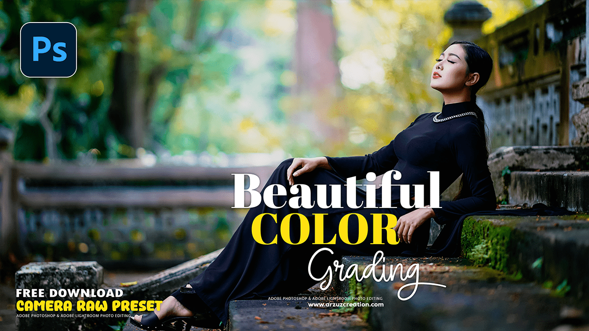
Outdoor Portrait Beautiful Colour Grading in Adobe Photoshop,
Therefore, Achieving beautiful color grading for outdoor portraits in Adobe Photoshop is a key step in transforming a good photo into a great one. While there’s no single “correct” way to do it, a combination of tools and techniques allows you to create a specific mood and enhance the natural beauty of the scene.
In other words, Here’s a breakdown of common techniques and adjustments to get you started:
Outdoor Portrait Beautiful Colour Grading in Adobe Photoshop,

1. Start with Non-Destructive Adjustments:
Therefore, Always work non-destructively. This means using Adjustment Layers instead of applying edits directly to your image layer. This allows you to go back and modify or remove an effect at any time.
- Duplicate your original layer: Before proceeding, duplicate your base image layer (Ctrl/Cmd + J). This serves as a safety net.
2. Foundational Adjustments in Adobe Camera Raw or Lightroom:
Therefore, Many photographers begin their color grading process in Camera Raw or Lightroom, as it’s great for basic tonal and color corrections.
- White Balance: The most critical first step. Use the white balance eyedropper tool to click on a neutral gray or white area in your photo. This corrects any color casts and gives you a true starting point.
- Basic Tonal Adjustments: Adjust the exposure, highlights, shadows, whites, and blacks to get a good base for your image. This is where you’ll bring back detail in overexposed skies or in deep shadows.
- HSL/Color Mixer: This is a powerful tool for targeting and adjusting specific colors. You can change the hue, saturation, and luminance of individual colors (e.g., make greens more vibrant, or shift the oranges in skin tones towards yellow for a sun-kissed look).
Outdoor Portrait Beautiful Colour Grading in Adobe Photoshop,
3. Key Photoshop Adjustment Layers for Color Grading:
In other words, Once you’ve done your initial corrections, move into Photoshop to apply more specific color grading techniques.
- Curves: This is one of the most versatile tools for both contrast and color.
- Contrast: Create an S-shaped curve in the main RGB channel to add contrast. Drag the shadows down and the highlights up.
- Color Shifts: Work with the individual Red, Green, and Blue channels to add specific color casts to your shadows and highlights. For example, to create a popular cinematic look, you can add blues to the shadows and yellows to the highlights.
- Blue Channel: Lowering the top right of the curve adds yellow to the highlights; raising the bottom left adds blue to the shadows.
- Red Channel: Lowering the top right of the curve adds cyan to the highlights; raising the bottom left adds red to the shadows.
- Color Balance: This is a straightforward tool for adding color to your shadows, midtones, and highlights. It’s an excellent way to introduce a specific color palette (e.g., adding warm tones to the highlights or cool tones to the shadows).
Outdoor Portrait Beautiful Colour Grading in Adobe Photoshop,
- Selective Color: This adjustment layer allows you to manipulate specific color ranges in your image. It’s a precise way to refine your colors, such as desaturating the reds and yellows in a subject’s skin to make it look less flushed.
- Gradient Map: In other words, A powerful and often overlooked tool. A Gradient Map maps the tones of your image to a gradient you define. By setting the blend mode to “Color” or “Soft Light” and lowering the opacity, you can apply a subtle and sophisticated color grade. This is perfect for creating duotone or cinematic effects.
- Color Lookup (LUTs): Color Lookup Tables (LUTs) are essentially color grading presets. Photoshop comes with a variety of built-in LUTs that can give you a specific look instantly, such as “Filmstock” or “Teal and Orange.” You can also download and install custom LUTs. Always remember to lower the opacity of the layer to avoid an overpowering effect.
4. Advanced Techniques for Specific Looks:
- Complementary Colors: A classic principle of color grading is to use complementary colors (colors opposite each other on the color wheel). A very common combination for cinematic looks is to add warm colors (yellows, oranges) to the highlights and cool colors (blues, teals) to the shadows.
- Dodge and Burn: In other words, Once the color is graded, use dodging and burning (lightening and darkening specific areas) to add depth and dimension to your subject. This can be done with a Curves adjustment layer and a soft black brush on a layer mask. Dodge to make the subject’s face pop and burn to create a vignette effect around the edges of the frame.
- Final Touches: Consider adding a subtle amount of Camera Raw Filter grain for a film-like texture. You can also make a final Curves adjustment to fine-tune the overall contrast.
Camera Raw Presets Free Download,
By combining these different adjustment layers, you can build up a custom color grade that perfectly suits the mood and style of your outdoor portrait. The key is to experiment with blending modes and opacity to achieve a look that is both striking and natural.
