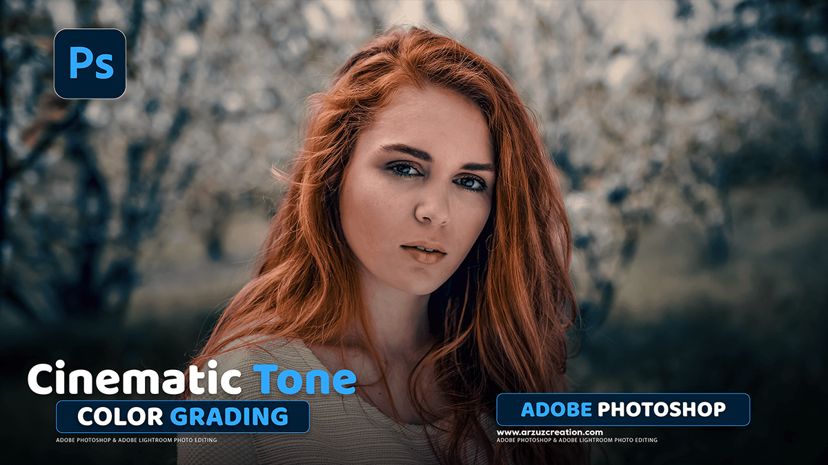
Photoshop Cinematic Color Grading Tutorial,

Therefore, Cinematic color grading in Photoshop is a post-processing technique used to give an image the dramatic, stylized, and often mood-driven color palettes seen in films. It typically involves Split Toning, often using complementary colors like the famous Teal and Orange look, and the use of LUTs (Look Up Tables) for quick, professional results.
Here are the primary methods and techniques used in Photoshop:
Photoshop Cinematic Color Grading Tutorial,
1. Split Toning with Complementary Colors 🎨
Therefore, the most common cinematic look involves applying different colors to the shadows and highlights, typically using complementary colors to create high visual contrast. The Teal (blue-green) and Orange (skin tones/warm light) palette is a classic example.
Using Camera Raw Filter (or Lightroom)
Therefore, this method provides precise control over different tonal ranges:
- In other words, open your image in Photoshop and convert the layer to a Smart Object for non-destructive editing (right-click layer, select Convert to Smart Object).
- However, Go to Filter > Camera Raw Filter.
- In other words, navigate to the Color Grading panel (or Split Toning in older versions).
- However, in the Shadows color wheel, choose a cool color like blue, cyan, or teal. Adjust the Blending slider (if available) and Luminance (darkness/brightness) to taste.
- However, in the Highlights color wheel, choose a warm color like orange, yellow, or gold. Adjust the Blending slider and Luminance.
- In other words, the Midtones wheel can be used to fine-tune the transition between the two tones or to add a general color cast.
Photoshop Cinematic Color Grading Tutorial,
Using Solid Color Fill Layer (Exclusion Blend Mode)
However, this is a quick and simple way to achieve split toning:
- Above all, add a Solid Color adjustment layer (Layer > New Fill Layer > Solid Color). Choose a cool color (e.g., a dark blue).
- In addition, change the blending mode of the color fill layer from Normal to Exclusion.
- Reduce the layer’s Opacity (often to between 10% and 40%) to soften the effect.
- Above all, Double-click the color swatch of the fill layer to change the color and instantly see the effect on the highlights (which automatically receive the complementary color).
Photoshop Cinematic Color Grading Tutorial,
2. Using LUTs (Look Up Tables)
LUTs are pre-calculated files (.CUBE or .3DL) that quickly remap the colors and tones of your image to achieve a specific look, often mimicking film stocks or specific movie grades.
- Above all, add a Color Lookup adjustment layer (Layer > New Adjustment Layer > Color Lookup).
- In addition, in the Properties panel, choose either Load 3DLUT or select from the pre-installed LUTs (e.g., Filmstock or Fuji/Kodak emulations).
- Above all, once the LUT is applied, reduce the layer’s Opacity (e.g., 30%-70%) to control the intensity of the effect, as most LUTs are designed to be a starting point.
Photoshop Cinematic Color Grading Tutorial,
3. Curves for Contrast and Tone:
In addition, the Curves adjustment layer is essential for creating the film-like contrast that’s a hallmark of the cinematic look:
- After that, add a Curves adjustment layer.
- After that, create a subtle ‘S’ curve on the main RGB channel to boost contrast:
- Drag the lower-left point down slightly (crushing the blacks).
- Drag the upper-right point down slightly (muting the whites).
- Pull the quarter-tone up slightly and the three-quarter tone down slightly to create the ‘S’ shape.
- In addition, to adjust color toning: Switch to the individual Red, Green, or Blue channels. For example, lowering the bottom point of the Blue channel adds yellow to the shadows, and raising the bottom point of the Blue channel adds blue to the shadows.
Camera Raw Presets Free Download,
4. Other Essential Adjustments:
- Color Balance: Used to shift the color cast of the shadows, midtones, and highlights independently.
- Vibrance/Saturation: Often used to slightly desaturate the overall image to mimic the look of film, or to use Vibrance to boost less-saturated colors while protecting natural skin tones.
- Film Grain: Add a layer of realistic noise (Filter > Noise > Add Noise) and set the blend mode to Soft Light or Overlay with a reduced opacity to simulate the texture of film.
- Letterboxing: Add black bars to the top and bottom of the image to achieve a common widescreen aspect ratio (e.g., 2.35:1) for a finished cinematic presentation.
