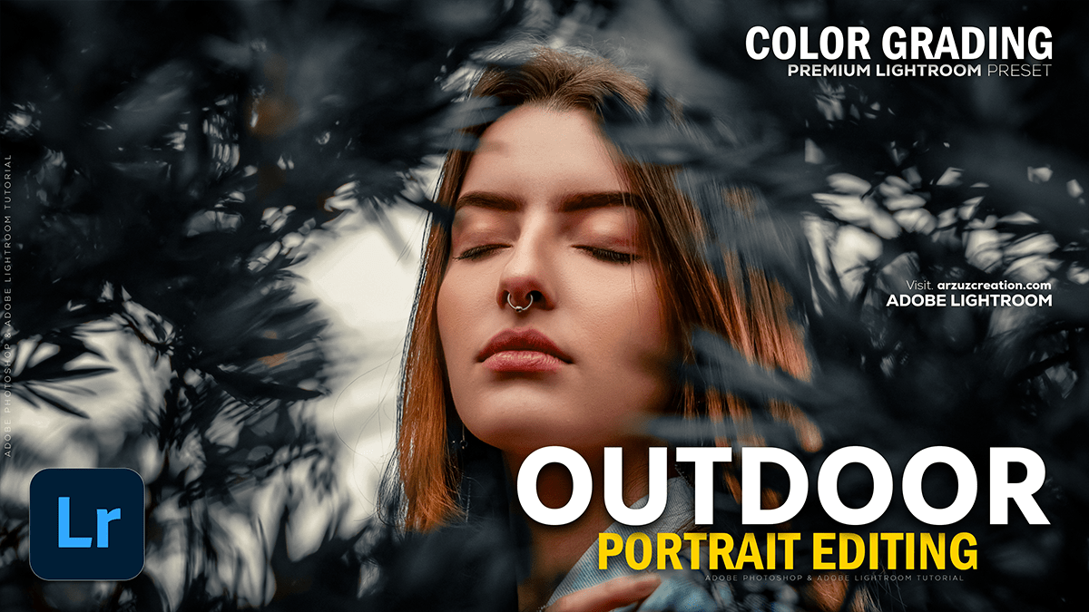
Adobe Lightroom Outdoor Photo: Color Grading Tutorial 2025,

Therefore, Color grading is a crucial step for giving your outdoor portraits a specific mood or style in Lightroom. Since there’s no single “best” setting, here’s a general approach and some popular styles for outdoor portrait color grading:
Adobe Lightroom Outdoor Photo: Color Grading Tutorial 2025,

🎨 General Color Grading Workflow:
Start with basic corrections, then move to color adjustments:
- Basic Adjustments (Develop Panel):
- White Balance (Temp & Tint): Set a good starting point. For outdoor warmth, increase the Temperature slightly. For a cooler, moody look, decrease it.
- Exposure & Contrast: Therefore, adjust to ensure your subject is properly exposed. Use the Contrast slider or the Tone Curve (S-curve for punchy, inverse S-curve for matte).
- Highlights & Shadows: Recover detail. Decrease Highlights to bring back sky detail; increase Shadows to brighten the subject.
- Blacks & Whites: Set your black and white points for maximum dynamic range.
- HSL / Color Panel:
- Therefore, this is where you target specific colors. For outdoor portraits, focus on:
- Greens (Nature/Foliage): Therefore, Adjust Hue to make them more yellow (autumn feel) or more aqua (modern/cool). Adjust Saturation and Luminance to mute or enhance.
- Oranges/Yellows (Skin Tones/Warmth): Be very careful with Oranges as they affect skin tone. Adjusting the Luminance of oranges/reds can make skin brighter or darker.
- Blues (Sky): Adjust Hue towards aqua or purple, and reduce Luminance to deepen the sky.
- Therefore, this is where you target specific colors. For outdoor portraits, focus on:
Adobe Lightroom Outdoor Photo: Color Grading Tutorial 2025,
- Color Grading Panel (formerly Split Toning):
- Therefore, this is the core color grading tool, allowing you to add color casts to your Shadows, Midtones, and Highlights.
- Shadows: Often pulled towards a Cool Hue (Blues, Cyans) to add depth.
- Highlights: Often pulled towards a Warm Hue (Yellows, Oranges) to enhance sunlight.
- Therefore, Adjust Blending to control the transition between the tones and Balance to shift the effect towards shadows or highlights.
🌟 Popular Outdoor Portrait Styles:
1. Warm & Vibrant (Golden Hour Look)
In other words, this is a classic, inviting look.
- White Balance: Increase Temperature (warmer).
- HSL: In other words, increase the Saturation and Luminance of Oranges and Yellows slightly. Shift Red and Orange Hues toward Yellow.
- Color Grading:
- Highlights: In other words, Warm color (e.g., Hue 40-60, Saturation 10-20).
- Shadows: Subtle cool color (e.g., Hue 220-240, Saturation 5-10).
Adobe Lightroom Outdoor Photo: Color Grading Tutorial 2025,
2. Moody & Desaturated (Cinematic Look)
In other words, this look often features muted colors and deep shadows.
- Basic: Increase Contrast and decrease Exposure slightly.
- HSL: In other words, decrease the Saturation of most colors (especially Greens and Blues). You may want to slightly increase the Orange saturation to keep the subject’s skin from looking flat.
- Tone Curve: In other words, use a subtle S-curve for contrast, but raise the left-most point (Blacks) to fade the shadows (Matte look).
- Color Grading:
- Shadows: Cool, deep color (e.g., Hue 240, Saturation 15-25).
- Highlights: Often left neutral or a very subtle warm tone.
Adobe Lightroom Outdoor Photo: Color Grading Tutorial 2025,
3. Clean & Modern (High-Key Look)
In other words, this style is bright, clean, and often slightly cool or neutral.
- Basic: Increase Exposure and Whites. Decrease Blacks and Shadows for a bright, open feel.
- White Balance: Slightly cooler (Temperature down) or neutral.
- HSL: Ensure Greens are not too yellow. Adjust Saturation and Luminance of most colors to be balanced (not overly saturated).
- Color Grading: Use very subtle color casts, if any, keeping the overall image bright and natural.
Pro Tip: Always monitor your subject’s skin tones in the HSL/Color panel. Over-adjusting the Orange or Red channels can ruin a portrait.
In conclusion, do you have a specific style in mind, like a “moody forest” or “bright, airy beach” look, that I can give more detailed settings for?
