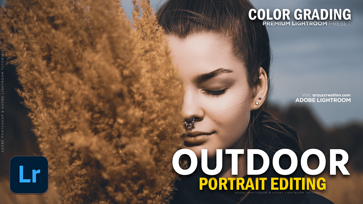
Adobe Lightroom Color Correction: Color Grading Tutorial 2025,
Therefore, that’s a fantastic and very common topic in Lightroom! Color correction is about achieving a technically accurate, balanced image, while color grading is about adding style and mood.
Adobe Lightroom Color Correction: Color Grading Tutorial 2025,

Therefore, here is a general, step-by-step process you can follow for outdoor portrait photos in Lightroom:
🎨 Step 1: Essential Color Correction (Basic Panel)
Therefore, the goal here is to get a clean, neutral starting point.
- Set Profile: Start with a neutral profile like Adobe Standard or Adobe Neutral to give yourself the most editing control, or Adobe Portrait for a portrait-specific starting point.
- White Balance (WB): This is crucial for skin tones.
- Therefore, use the Eyedropper Tool on something in the photo that should be neutral gray or white (e.g., a white t-shirt, a gray sidewalk).
- In other words, if no neutral point exists, manually adjust the Temperature (for cool/warm) and Tint (for green/magenta) until the skin tones look natural. Tip: A slight warmth often looks best in portraits.
- Exposure & Contrast:
- Therefore, Adjust Exposure to get the overall brightness right.
- In other words, fix any clipped whites/blacks using Highlights, Shadows, Whites, and Blacks. Tip: Often, you want to bring down Highlights and lift Shadows to recover detail.
Adobe Lightroom Color Correction: Color Grading Tutorial 2025,

🖼️ Method 2: Tone & Detail Refinement:
In other words, these adjustments fine-tune the look.
- Tone Curve: Use this for deeper contrast control. An “S” curve adds contrast to the mid-tones, making the image pop. You can also slightly lift the bottom-left point (Black Point) for a popular matte or “faded film” look.
- Presence (Clarity, Dehaze, Vibrance/Saturation):
- Clarity: In other words, use this sparingly on portraits. A slight positive value adds punch; a slight negative value ($\sim -5$ to $-15$) can subtly soften the skin.
- Vibrance: Increase this rather than Saturation, as it boosts the less-saturated colors (like greens and blues) more, while being more gentle on already-saturated skin tones.
- Saturation: Use very little, if any, global saturation.
🌈 Step 3: Localized Color Grading (HSL/Color Mixer)
However, this is where you target specific colors in the scene. For outdoor portraits, the main colors to adjust are typically Oranges/Reds (skin tones) and Greens/Yellows/Blues (environment).
| Color | Panel | Adjustment Goal |
| Orange | Hue, Saturation, Luminance | Crucial for skin tones. Adjust Hue to make skin less yellow/red, and Luminance to brighten it. Be very subtle! |
| Yellow | Hue, Saturation, Luminance | Controls the color of sunlight/haze and often greens. Shift the Hue slightly towards orange to warm up the scene and affect grass/leaves. |
| Green | Hue, Saturation, Luminance | Adjust to change the look of foliage. Shift Hue towards Yellow for a brighter, spring look, or towards Aqua for a darker, moody look. Reduce Luminance to darken the background and make the subject pop. |
| Blue | Hue, Saturation, Luminance | Controls the sky and water. Shift Hue toward Aqua/Cyan for a more cinematic feel. Increase Saturation and reduce Luminance for a richer, darker sky. |
Adobe Lightroom Color Correction: Color Grading Tutorial 2025,
🌗 Method 4: Split Toning / Color Grading Panel (Adding Mood)
However, this panel allows you to introduce different colors into the shadows, midtones, and highlights.
- Shadows: Often, a Cool color (like a subtle blue or teal) is added to the shadows to contrast with the warm skin tones.
- Highlights: Often, a Warm color (like a subtle yellow or orange) is added to enhance the sunlight or glow on the subject’s face.
- Blending and Balance sliders control how the colors interact. Tip: Keep Saturation low (e.g., 5-20) for a subtle, professional look.
Adobe Lightroom Color Correction: Color Grading Tutorial 2025,
✨ Step 5: Local Adjustments (Masking)
However, Use Masks to apply edits to specific areas:
- Subject/Face: Brighten the subject’s face or eyes with a mask and slightly increase Exposure and Clarity.
- Background: Use an Invert mask or Select Background to reduce Luminance and Saturation in the background, making the person stand out more.
In conclusion, would you like to explore a specific style of outdoor portrait (e.g., warm and vibrant, dark and moody, or bright and airy), or perhaps learn how to create a cinematic teal and orange effect?
