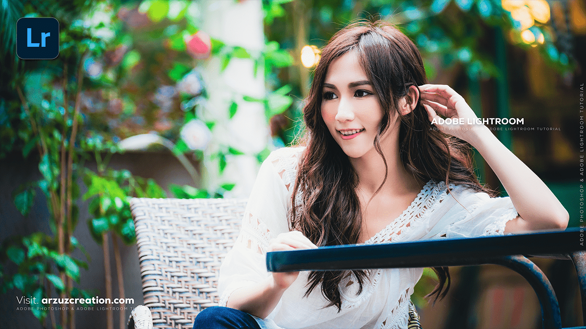
Adobe Lightroom: Portrait Colour Grading Tutorial For Beginners,

Therefore, that’s a fantastic area to dive into! Color grading an outdoor portrait in Lightroom is where you can truly give your photo a unique mood and style.
In other words, since “outdoor portrait” can cover everything from a bright sunny beach shot to a moody forest image, the approach will vary, but here is a general workflow and popular styles:
Adobe Lightroom: Portrait Colour Grading Tutorial For Beginners,
🎨 General Outdoor Portrait Color Grading Workflow
Therefore, no matter the style, follow these steps in Lightroom for a powerful edit:
1. The Foundation (Basic Panel)
- White Balance: Therefore, set this first. Use the eyedropper tool on a neutral gray or white area, or manually adjust Temp (warm/cool) and Tint (green/magenta) to correct any major color casts.
- Exposure: Get the brightness correct.
- Contrast, Highlights, & Shadows: In other words, recover detail. Reduce Highlights to bring back cloud detail; increase Shadows to lighten dark areas.
- Blacks & Whites: Therefore, hold
Alt/Optionwhile dragging the sliders to ensure you don’t clip (lose detail in the pure black/white areas). - Presence (Clarity, Texture, Dehaze): In other words, use these subtly. Clarity and Texture are great for defining edges, and Dehaze can help reduce atmospheric haze or add moodiness.
Adobe Lightroom: Portrait Colour Grading Tutorial For Beginners,
2. The Color Mixer (HSL/Color Panel)
In other words, this is critical for portraits, as you need to protect the skin tone while adjusting the rest of the image.
- Target the Skin Tones: In other words, Focus on the Orange and Red hues and saturation.
- Hue: Adjust Orange Hue slightly left or right to fine-tune the skin color (less red or less yellow).
- Saturation: Subtly lower the Orange Saturation to make skin look less intense, but be careful not to make it look pale.
- Luminance: Increase Orange Luminance to brighten the skin, which is often very flattering.
- Target Background Colors: Adjust the Greens (for grass/trees) and Blues (for sky).
- For a Warm/Golden look: Shift Green Hue towards Yellow, and potentially Blue Hue towards Aqua.
- For a Cool/Moody look: Shift Green Hue towards Teal, and potentially Blue Hue towards Purple.
Adobe Lightroom: Portrait Colour Grading Tutorial For Beginners,
3. The Mood (Color Grading Panel)
In other words, this is where you add a creative “wash” of color to the image.
- Shadows: Add a cool tone (blue or teal) to the shadows. This is a very common cinematic technique that separates the subject from the background.
- Highlights: Add a warm tone (yellow or orange) to the brightest parts, especially if you want a “Golden Hour” feel.
- Midtones: A subtle complementary color here can complete the look.
4. The Fine-Tuning (Tone Curve & Calibration)
- Tone Curve: However, use a subtle S-Curve for more contrast, or a faded look by raising the bottom-left point (the black point) on the curve. You can also use the Red, Green, and Blue channels for very fine color shifts.
- Calibration: This panel affects how Lightroom interprets the primary colors.
- However, changing the Blue Primary Hue (often pulling it slightly left, toward Cyan) is a powerful way to create the popular Orange & Teal look.
Adobe Lightroom: Portrait Colour Grading Tutorial For Beginners,
🔥 Popular Outdoor Portrait Styles
1. Warm & Golden (Golden Hour Look)
- Basic: Increase the Temperature slightly.
- HSL/Color: However, Push Yellow & Orange Hues toward Red. Increase the Saturation and Luminance of Yellows to make the light glow.
- Color Grading: Add warm tones (Yellow/Orange) to Highlights and Midtones.
2. Cool & Moody (Desaturated, Cinematic)
- Basic: Decrease the Temperature slightly. Reduce Contrast and increase Blacks for a matte/film look.
- HSL/Color: However, Reduce the Saturation of Greens and Blues. Shift Green Hues toward Teal/Blue.
- Color Grading: Add cool tones (Blue/Teal) to Shadows and potentially a slight shift of Orange/Yellow to Highlights for a complementary split tone.
3. Light & Airy (Bright, Pastel)
- Basic: Increase Exposure. Lower Contrast significantly. Raise Blacks and lower Highlights.
- Tone Curve: Create a significant fade by raising the black point.
- HSL/Color: Lower the overall Saturation and potentially shift Green Hues toward Yellow.
Do you have a specific mood or time of day (e.g., sunset, overcast, mid-day) you’re trying to achieve with your outdoor portrait? I can give you more specific slider adjustments!
