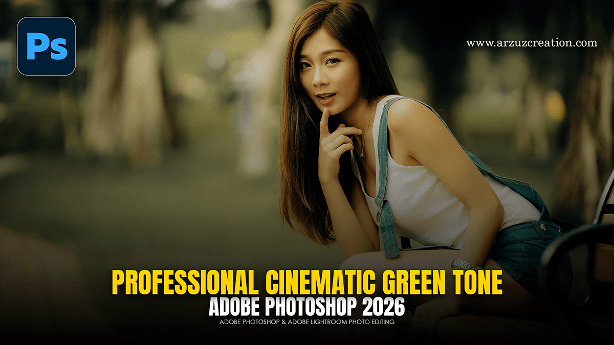
Professional Cinematic Green Colour Tone in Adobe Photoshop,

Therefore, achieving a professional cinematic green color grade in Adobe Photoshop involves a combination of shifting hue, managing saturation, and controlling luminance to create a cohesive mood.
Professional Cinematic Green Colour Tone in Adobe Photoshop,
1. Color Balance (Midtones & Shadows)
Therefore, to establish the base “cinematic” look, the goal is often to push greens into the shadows while maintaining a complementary balance in the highlights.
Shadows: In other words, Add Green and a hint of Blue (Teal-Green) to create depth.
Midtones: Therefore, lean slightly toward Green or Yellow to bridge the shadows and highlights.
Highlights: In other words, keep these relatively neutral or add a touch of Red/Yellow (Warmth) to provide contrast against the green shadows.
2. Selective Color Adjustments:
In other words, this is the most effective way to refine specific green tones without affecting the entire image.
Professional Cinematic Green Colour Tone in Adobe Photoshop,
Greens: However, decrease the Magenta slider (which adds Green) and increase Cyan. Adjust the Black slider to make the greens appear deeper and more “moody.”
Yellows: Since many natural greens are actually categorized as “Yellow” in Photoshop, shifting the Yellows toward Cyan will create a colder, more forest-like green.
Whites/Neutrals: However, use these to subtly tint the overall “air” of the photo with a 1% or 2% green wash.
3. The Curves Layer (Channel Editing)
However, for precise control, use the individual color channels within a Curves adjustment layer:
Green Channel: Lift the bottom-left point (Shadows) slightly to “wash” the blacks with a green tint.
Red Channel: Pull the middle of the curve down slightly; removing Red is mathematically equivalent to adding Cyan, which pushes the greens toward a more modern, cinematic “Teal-Green” palette.
Professional Cinematic Green Colour Tone in Adobe Photoshop,
4. Finishing Touches:
Color Lookup (LUTs): Apply a “FoggyNight” or “Moonlight” LUT at a low opacity (10%–20%) to unify the colors.
Curves (S-Curve): Add a slight S-curve on a separate layer to regain contrast, as color grading can sometimes make an image look “flat.”
Vignetting: A subtle dark vignette focuses the viewer’s eye and enhances the “moody” green atmosphere.
Would you like me to generate a step-by-step guide for a specific style, such as a “Matrix-inspired” look or a “Moody Forest” aesthetic?
