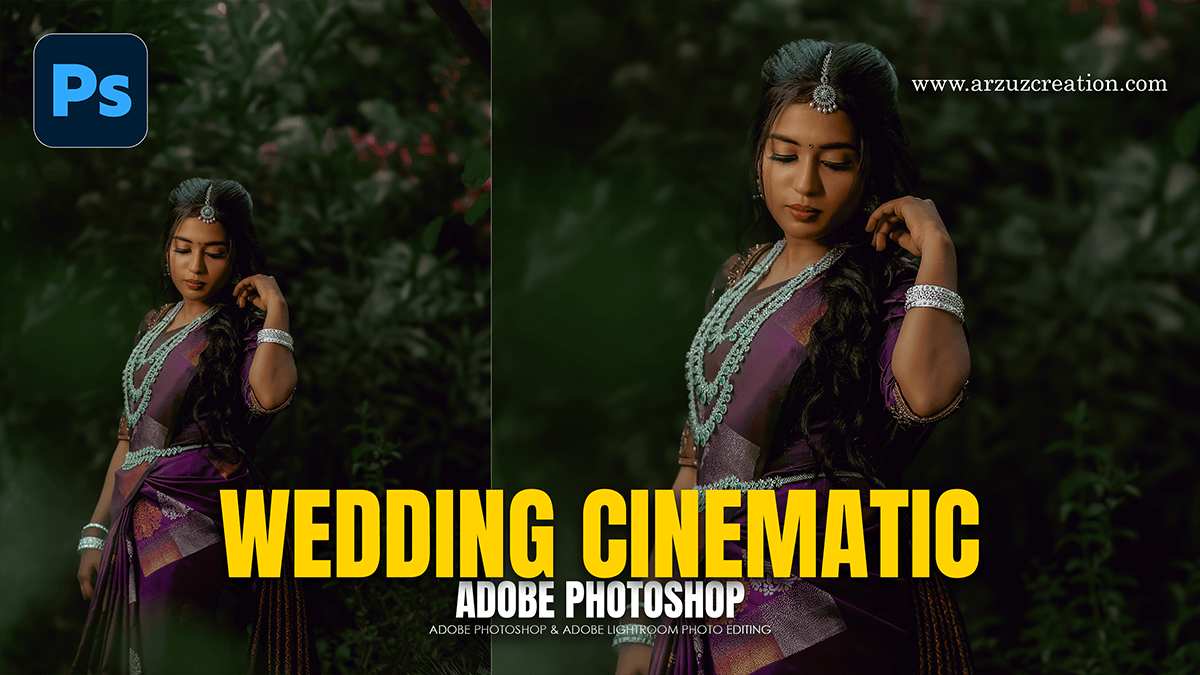
Wedding Outdoor Portrait Cinematic Colour Grading in Photoshop,

Therefore, achieving a cinematic look for outdoor wedding portraits requires a balance between preserving natural skin tones and creating a cohesive, moody, or “filmic” atmosphere.
In other words, here is a workflow to achieve a high-end cinematic grade using the Camera Raw Filter (Ctrl+Shift+A).
1. Basic Panel: Setting the Foundation:
Therefore, before grading, you need a “flat” starting point to maximize dynamic range.
Wedding Outdoor Portrait Cinematic Colour Grading in Photoshop,
Temperature: Therefore, Lean slightly Warm (Yellow) for sunset/golden hour or slightly Cool (Blue) for a moody, “twilight” film look.
Highlights: Drop to -40 to -60 to recover detail in the wedding dress.
Shadows: In other words, boost to +30 to +50 to reveal details in the groom’s suit or dark backgrounds.
Texture & Clarity: However, be careful here. Keep Clarity low (-10) for a dreamy, soft skin glow, but add a touch of Texture (+10) for detail.
2. Curve Panel: The “Matte” Film Look:
In other words, The Tone Curve is the most important tool for the cinematic aesthetic. Create an S-Curve on the Point Curve:
The Blacks: However, lift the bottom-left point slightly upward. This “fades” the true blacks into a dark charcoal gray, common in film.
The Midtones: Pull the middle down slightly to add contrast.
The Highlights: However, soften the top-right point by pulling it down a fraction to prevent “digital” clipping.
Wedding Outdoor Portrait Cinematic Colour Grading in Photoshop,
3. Color Mixer: Directing the Palette:
For instance, for a cinematic look, you want to simplify the colors.
Hues: However, Shift Yellows toward Orange and Greens toward Aqua/Blue (this creates a more “expensive” forest or grass look).
Saturation: * Decrease Greens and Yellows (around -30) to make the background less distracting.
However, slightly increase the oranges if the skin looks too pale.
Luminance: Increase Orange Luminance to make the couple “pop” from the background by brightening their skin.
4. Color Grading: The Cinematic “Split Tone.”
However, this panel adds the specific “tint” to your highlights and shadows.
Shadows: For instance, Aim for Teal or Deep Blue (Hue: 210-220). Keep Saturation low (under 10%).
Highlights: Aim for Warm Gold or Cream (Hue: 40-50).
Blending/Balance: For instance, push the Balance slider toward the right to ensure the warm highlights dominate the skin tones.
Wedding Outdoor Portrait Cinematic Colour Grading in Photoshop,
5. Optics and Effects: The Final Touch:
Vignetting: Add a subtle post-crop vignette (-15) to draw the eye toward the couple.
Grain: Cinematic shots aren’t perfectly smooth. Add a small amount of Grain (Amount: 15, Size: 25, Roughness: 50) to emulate 35mm film stock.
Calibration (Bottom Tab): This is a “secret” pro tip. Increase the Blue Primary Saturation. This often makes the entire image feel more vivid and professional without looking “oversaturated.”
Pro Tip: If the dress loses too much detail after grading, use the Adjustment Brush (K) to selectively mask the dress and pull the Highlights down further or increase the Whites for a clean, pearlescent finish.
