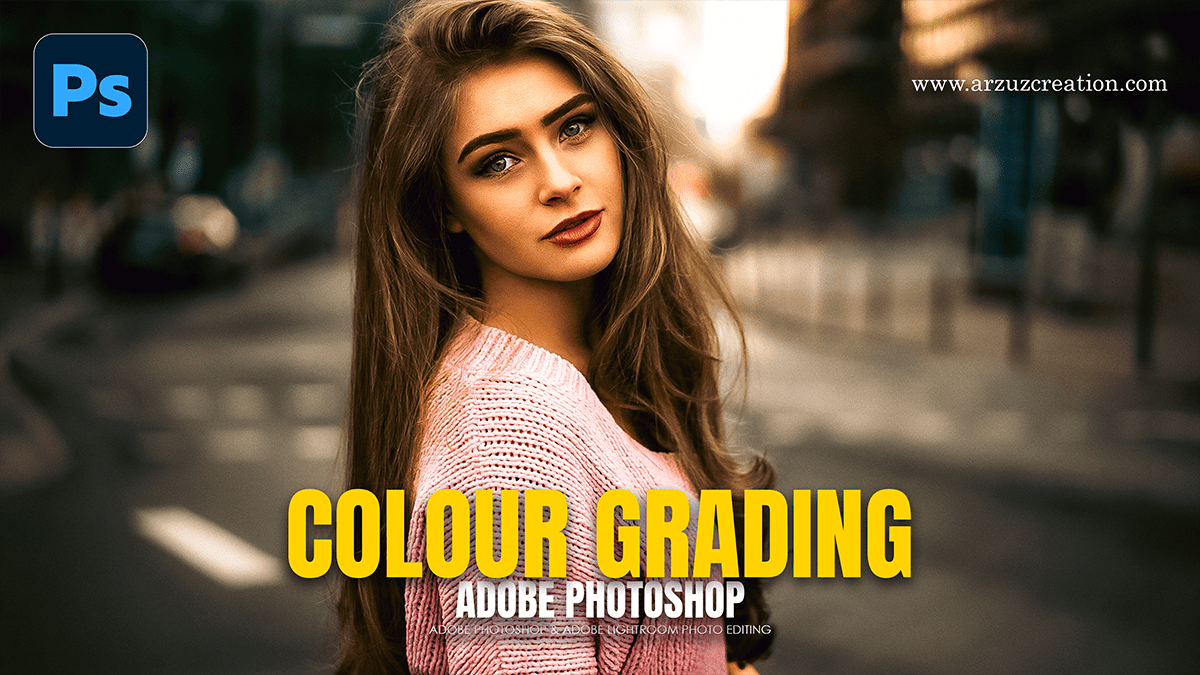
Learn how to do Colour Grading in Adobe Photoshop

Therefore, Color grading in Photoshop is the process of altering the color, contrast, and tone of an image to create a specific aesthetic or mood. In other words, unlike color correction (which fixes issues like white balance), grading is a creative choice.
In other words, here is a workflow to master color grading using non-destructive adjustment layers.
Learn how to do Colour Grading in Adobe Photoshop,
1. The Foundation: Camera Raw Filter:
Therefore, the most powerful way to start is the Camera Raw Filter. It provides a dedicated interface for high-level color control.
In other words, go to Filter > Camera Raw Filter (or press. Ctrl+Shift+A).
Color Mixer: However, adjust the Hue, Saturation, and Luminance (HSL) of individual colors. For a cinematic look, try shifting your Greens toward Yellow or your Blues toward Cyan.
Color Grading Panel: In other words, this provides three “Color Wheels” for Shadows, Midtones, and Highlights.
Pro Tip: However, A classic “Teal and Orange” look involves adding Blue/Teal to the Shadows and Orange/Gold to the Highlights.
2. Using Adjustment Layers:
For instance, always use the Adjustments Panel (Window > Adjustments) so you don’t permanently change your original pixels.
Learn how to do Colour Grading in Adobe Photoshop,
Selective Color:
For instance, this is a favorite for professional photographers. It allows you to modify the specific ink components of a color.
Above all, Select Reds and decrease Cyan to make skin tones warmer.
For instance, Select Neutrals and tweak the sliders to subtly shift the overall “wash” of the image.
Color Balance
Above all, this is the quickest way to fix or add color casts.
For instance, use the Tone dropdown to target Highlights or Shadows specifically.
Above all, if your image feels too “cold,” slide the bars toward Red and Yellow.
Learn how to do Colour Grading in Adobe Photoshop,
Gradient Map
In addition, this is a more advanced technique for “mapping” specific colors to the light and dark areas of your photo.
Above all, create a Gradient Map adjustment layer.
In addition, click the gradient bar to open the editor. Set the left side (Shadows) to a dark navy and the right side (Highlights) to a soft cream or peach.
Crucial Step: Change the layer Blending Mode to Soft Light or Overlay and lower the Opacity to 20–30%.
3. The “Secret Sauce”: LUTs (Color Lookup Tables)
After that, Photoshop comes with built-in cinematic presets called LUTs.
In addition, click the Color Lookup icon in the Adjustments panel.
After that, click the 3DLUT File dropdown.
In addition, try options like “Crisp_Warm”, “LateSunset”, or “TealOrange”.
After that, adjust the layer opacity to make the effect as subtle or dramatic as you like.
Learn how to do Colour Grading in Adobe Photoshop,
4. Final Polish: Curves:
In addition, Curves is the most precise tool for controlling contrast alongside color.
After that, open a Curves layer.
insteadtion, Instead of “RGB,” select the Red, Green, or Blue channels individually.
After that, creating an “S-Curve” in the Blue channel (lifting the shadows and dropping the highlights) will add Blue to the dark areas and Yellow to the bright areas.
Quick Tips for Consistency:
Check your Histogram: Ensure you aren’t “clipping” (losing detail) in your blacks or whites while pushing colors.
Take a break: Your eyes “normalize” to color shifts quickly. Look away for a minute and come back to see if you’ve pushed the colors too far.
Use Blend If: Right-click an adjustment layer, go to Blending Options, and use the “Blend If” sliders to prevent colors from bleeding into the deepest blacks or brightest whites.
