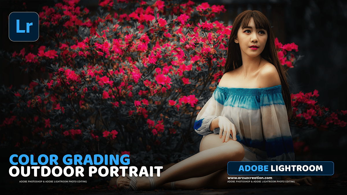
Lightroom- How to Edit Photo Colour Grading in Adobe Lightroom,
Therefore, that’s a great question! Colour grading is one of the most powerful ways to give your photos a unique style. In Lightroom, this is primarily done using the Colour Grading panel (or the older Split Toning panel in classic versions).

Therefore, here’s a step-by-step guide on how to approach colour grading in Lightroom:
Lightroom: How to Edit Photo Colour Grading in Adobe Lightroom,
1. Finding the Colour Grading Panel:
Therefore, first, make sure you’re in the Develop module in Lightroom Classic or the Edit section in Lightroom CC.
In other words, scroll down the right-hand panel until you find the Colour Grading panel (it’s usually located near the bottom, just above the Optics and Geometry panels).
2. Understanding the Colour Grading Tool:
In other words, the Colour Grading panel allows you to adjust the colours in three specific tonal ranges of your image:
- Shadows: The darkest areas.
- Midtones: The areas in between the shadows and highlights.
- Highlights: The brightest areas.
In other words, you’ll see three colour wheels, one for each of these ranges. There’s also a fourth global wheel that lets you adjust the overall hue and saturation.
Lightroom: How to Edit Photo Colour Grading in Adobe Lightroom,
3. The Grading Process:
A. Grading the Shadows:
- In other words, click on the Shadows colour wheel (the one on the left).
- To change the hue (colour): Drag the small dot inside the wheel. For a cinematic or moody look, people often add blues or cyans to the shadows.
- To change the saturation (intensity): Use the Saturation slider below the wheel. Moving it to the right increases the intensity of the colour you picked.
- To adjust the brightness: Use the Luminance slider to make the shadows darker or lighter.
B. Grading the Highlights:
- In other words, click on the Highlights colour wheel (the one on the right).
- To change the hue (colour): Drag the dot inside the wheel. To complement cool shadows, people often add yellows or oranges (warmer colours) to the highlights for a classic “teal and orange” look.
- To adjust the saturation (intensity), use the Saturation slider.
- To adjust the brightness, use the Luminance slider to control the intensity of the highlights.
Lightroom: How to Edit Photo Colour Grading in Adobe Lightroom,
C. Grading the Midtones (Optional)
- However, click on the Midtones colour wheel (the middle one).
- For instance, you can use this wheel to fine-tune the colour balance in the middle tones, though often people focus only on the shadows and highlights.
4. Using the Blending and Balance Sliders:
However, these two sliders at the bottom of the Colour Grading panel are crucial for a natural-looking grade:
- Blending: Above all, this controls how smoothly the colours you added to the shadows, midtones, and highlights transition into each other.
- Low Blending (Left): Creates a harsher, more noticeable separation between the tones.
- High Blending (Right): For instance, it creates a softer, more gradual mix. Most of the time, you’ll want a higher blending value.
- Balance: Above all, this shifts the influence of your grading between the shadows and highlights.
- Moving Left: Increases the influence of your Shadows colour grade.
- Moving Right: Increases the influence of your Highlights colour grade.
Lightroom: How to Edit Photo Colour Grading in Adobe Lightroom,
5. Other Key Panels for Colour Grading:
However, while the Colour Grading panel is the main tool, a truly great colour grade often involves adjustments in other panels:
- Basic Panel (Temp/Tint): For instance, use the White Balance sliders (Temp and Tint) at the very top to set the overall warmth and colour cast of the image before grading.
- HSL/Colour Mixer Panel: Use this to fine-tune specific colours. For example, if you want the blues in the sky to be deeper or the green foliage to be more muted.
- Tone Curve Panel: This is essential for setting the overall contrast and “mood.” Adjusting the RGB Curve can also introduce subtle colour casts across different tonal ranges.
Do you have a specific style in mind—like a cinematic, vintage, or dark and moody look—that you’d like to try?