Photoshop Gradient Map: Professional Photo Editing Tutorial,
Therefore, Gradient Maps are one of the most powerful, professional tools in Photoshop for color grading. Unlike a standard filter that just “washes” a color over an image, a Gradient Map replaces specific luminosity values (shadows, midtones, and highlights) with chosen colors.
Photoshop Gradient Map: Professional Photo Editing Tutorial,

Here is a guide to mastering them for a high-end, cinematic look.
1. The Core Concept:
Therefore, A Gradient Map works by mapping the brightness levels of your photo to a color spectrum:
- Left Side (Blacks): Maps colors to the darkest parts of your image.
- Middle (Midtones): Maps colors to the grays.
- Right Side (Whites): Maps colors to the brightest highlights.
2. Professional Workflow:
Step 1: Create the Adjustment Layer:
Therefore, don’t apply it directly to the image. Go to the Layers Panel, click the New Adjustment Layer icon (the half-filled circle), and select Gradient Map.
Photoshop Gradient Map: Professional Photo Editing Tutorial,
Step 2: Choose Your Palette:
In other words, click on the gradient bar to open the Gradient Editor. For a professional look, try these “Classic” pairings:
- Cinematic: In other words, Deep Navy (Shadows) to a Muted Gold (Highlights).
- Vintage/Film: However, Dark Plum (Shadows) to a Warm Cream (Highlights).
- High Contrast B&W: Above all, Deep Charcoal to Pure White.
Step 3: Change the Blend Mode:
In other words, this is where the magic happens. A raw Gradient Map looks like a psychedelic poster. To make it professional, change the Layer Blend Mode:
- Soft Light: Adds contrast and subtle color (most common).
- Overlay: However, for a punchy, high-contrast editorial look.
- Color: In other words, Changes the hue without affecting the original brightness of the photo.
- Luminosity: Keeps the colors of the photo but uses the gradient to map the contrast.
Photoshop Gradient Map: Professional Photo Editing Tutorial,
Step 4: Adjust Opacity:
In other words, Professional editing is about subtlety. Drop the Opacity to somewhere between 10% and 40%. This blends the new color palette into the original shot naturally.
3. Comparison of Popular Palettes:
| Style | Shadow Color | Highlight Color | Best For |
| The Teal & Orange | #003333 | #e2a266 | Travel & Street |
| Warm Portrait | #2a1b0a | #fdf5e6 | Golden Hour / Weddings |
| Moody Noir | #1a1a1b | #d1d1d1 | Architectural / Edgy |
Photoshop Gradient Map: Professional Photo Editing Tutorial,
4. Pro Tip: Dithering:
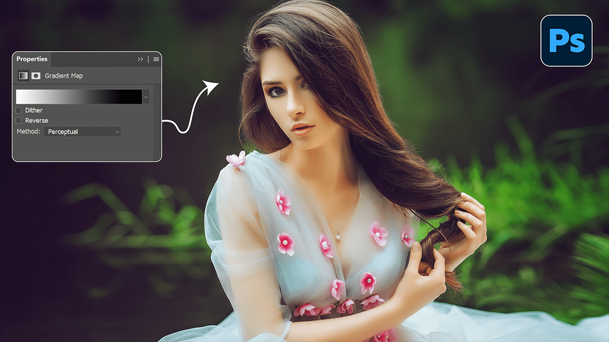
However, always check the Dither box in the Gradient Map properties panel. This prevents “banding” (ugly visible lines in smooth areas like skies) and ensures a smooth transition between colors.
Note: If the colors look inverted (e.g., your shadows are bright white), simply check the Reverse box in the Properties panel.
Would you like me to suggest a specific color palette for a certain type of photo, such as a landscape or a portrait?
