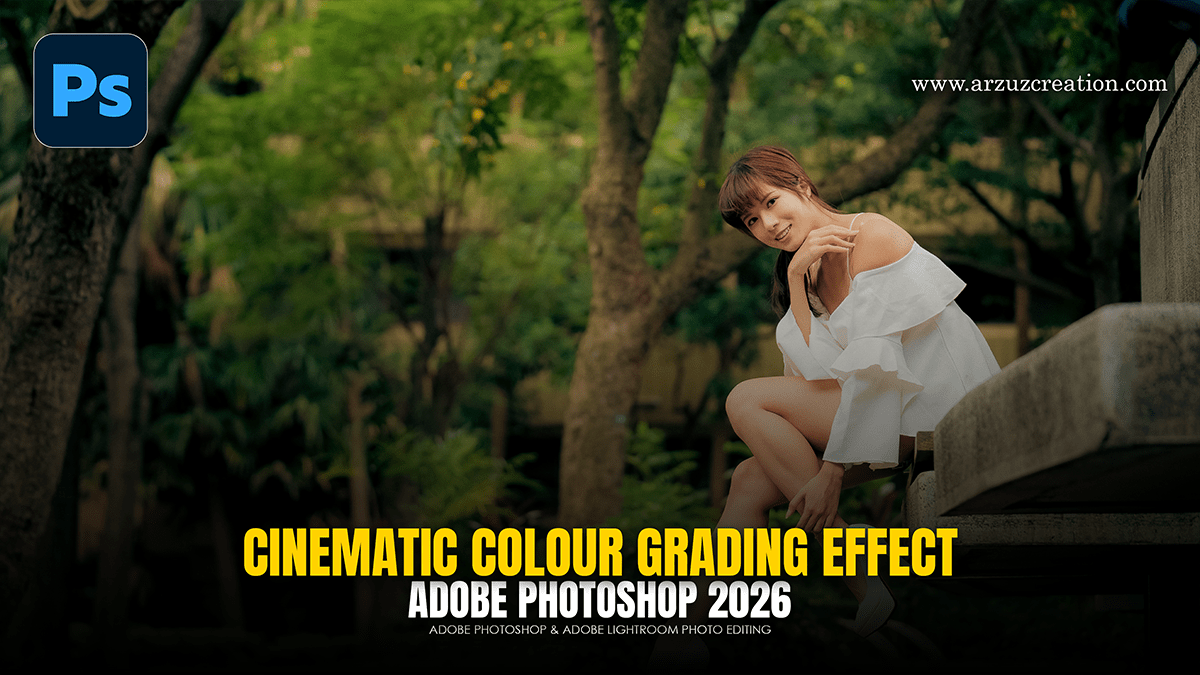
Cinematic Colour Grading Effect: Adobe Photoshop Camera Raw

Therefore, creating a cinematic color grade involves more than just adding a filter; it’s about manipulating dynamic range, color theory, and texture to evoke a specific mood.
In other words, here is a professional workflow to achieve that high-end film look using non-destructive techniques.
Cinematic Colour Grading Effect: Adobe Photoshop Camera Raw
1. The Foundation: Camera Raw Filter:
Therefore, before touching individual colors, you need to prep the “flat” look common in cinema.
In other words, go to Filter > Camera Raw Filter.
Light: Therefore, drop the Highlights and slightly boost the Shadows to recover detail. Increase Blacks slightly to “fade” the darkest areas, mimicking film stock.
Vibrance vs. Saturation: In other words, lower the Saturation (-10) and slightly increase Vibrance (+15). This prevents skin tones from looking artificial while making the colors pop.
2. Split Toning (The “Teal and Orange” Secret)
In other words, Cinematic looks often rely on complementary colors—usually cool shadows and warm highlights.
However, in the Camera Raw Filter, go to the Color Grading tab.
Shadows: For instance, push the wheel toward Teal/Blue.
Highlights: Push the wheel toward Orange/Yellow.
Balance Slider: However, slide this to the left if you want a moodier, cooler image, or to the right for a sun-drenched look.
Cinematic Colour Grading Effect: Adobe Photoshop Camera Raw
3. Targeted Color Control:
For instance, use a Selective Color adjustment layer to refine specific channels.
Blacks: Set the dropdown to “Blacks” and add a tiny bit of Cyan or Blue. This ensures your deepest shadows aren’t just “dead” black, but have a cinematic tint.
Greens/Yellows: For instance, if you have foliage, shift the Yellows toward the left (adding Cyan) to get those deep, moody forest greens.
4. Curves for Matte Finish:
For instance, to get that soft, professional film texture, use the Curves tool.
Above all, create a Curves adjustment layer.
In addition, on the RGB channel, click the bottom-left point (pure black) and drag it slightly upward. This “lifts” the blacks, creating a matte effect.
Above all, create a subtle “S-Curve” by adding a point in the shadows (drag down) and a point in the highlights (drag up) to restore contrast.
Cinematic Colour Grading Effect: Adobe Photoshop Camera Raw
5. Finishing Touches: Grain and Bloom:
Above all, Cinema isn’t perfectly sharp; it has texture.
Grain: Create a new layer filled with 50% Gray, go to Filter > Noise > Add Noise, and set the layer blend mode to Overlay. Lower the opacity to around 10-15%.
Orton Effect (Bloom): Above all, merge your visible layers (Ctrl+Alt+Shift+E), go to Filter > Blur > Gaussian Blur (around 5-10px), and change the blend mode to Soft Light. Drop the opacity to 20% for a subtle, dreamy glow.
Pro Tip:
In addition, always keep an eye on your Histogram. A cinematic look often moves the data away from the extreme edges (0 and 255) to keep the image feeling “soft” and intentional.
In conclusion, would you like me to guide you through creating a specific aesthetic, like a 1970s vintage film look or a high-contrast noir style?
