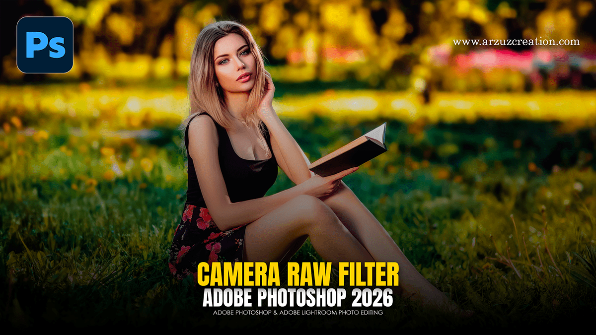
Colour Grading: Outdoor Portrait in Adobe Photoshop 2026,

Therefore, Color grading an outdoor portrait in Camera Raw allows for a high degree of control over the mood and “temperature” of the shot. Since you’re working with natural light, the goal is often to balance the skin tones while creating a cohesive color story.
In other words, here is a streamlined workflow to achieve a professional grade:
Colour Grading: Outdoor Portrait in Adobe Photoshop 2026,
1. The Color Mixer (Targeted Adjustments)
Therefore, the Color Mixer is the best place to start when correcting specific environmental tones, such as grass or sky.
Green/Yellow: In other words, if the foliage is too distracting, shift the Hue of Yellows and Greens toward Orange for a “warm/autumnal” look, or toward Cyan for a lush, “cool” look.
Blues: Use the Luminance slider to darken the sky, which adds drama and prevents a “blown out” look.
Oranges/Reds: Therefore, these control the skin. Lower the Saturation slightly and increase the Luminance to make the subject’s face pop and appear “lit from within.”
2. Color Grading (The Cinematic Touch)
In other words, this is where you apply specific hues to the Shadows, Midtones, and Highlights. This tool uses color wheels to create a stylistic “wash.”
Colour Grading: Outdoor Portrait in Adobe Photoshop 2026,
| Segment | Common Strategy | Result |
| Shadows | Add a subtle Teal or Deep Blue. | Creates a cinematic, high-contrast feel. |
| Midtones | Add a soft Peach or Gold. | Keeps the skin looking healthy and natural. |
| Highlights | Add a touch of Yellow or Cream. | Mimics the warmth of “Golden Hour” sunlight. |
However, Use the Blending and Balance sliders at the bottom of the Color Grading panel to decide how much the shadows and highlights “fight” for dominance.
3. Calibration (The “Secret” Step)
In other words, the Calibration panel (at the very bottom) is often overlooked but incredibly powerful for portraits.
Blue Primary: However, increasing the Saturation of the Blue Primary often makes all other colors in the image feel more vivid and “deep” without looking over-processed.
Red Primary: For instance, shifting the Red Hue slightly can help remove unwanted magenta or yellow casts from the skin.
Colour Grading: Outdoor Portrait in Adobe Photoshop 2026,
4. Final Polish: Effects & Curves:
Dehaze: For instance, use a small amount (+5 to +10) if the sunlight created a “veiling glare” on the lens.
Point Curve: Similarly, create a very subtle “S-Curve” in the Curves panel to add punch and contrast to the final grade.
In conclusion, would you like me to generate a visual example of how these specific color wheel settings (Teal Shadows/Gold Highlights) look on a portrait?
