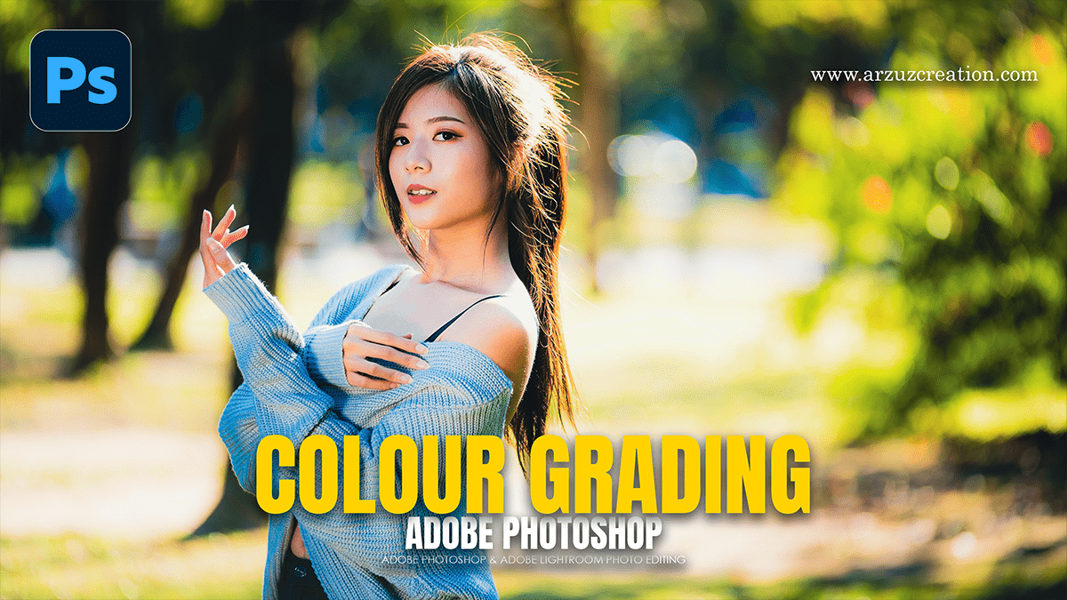
Basic to Advanced Photoshop Camera Raw Color Grading Guide,

Therefore, Color grading in Adobe Photoshop’s Camera Raw Filter is the process of altering the visual tone, mood, and style of an image. In other words, it moves beyond simple “correction” (fixing exposure or white balance) into “stylization.”
Basic to Advanced Photoshop Camera Raw Color Grading Guide,
1. Basic Level: The Foundation:
Therefore, before applying stylistic colors, the image must be “clean.” This ensures the grading is applied to a balanced canvas.
White Balance: In other words, use the Temperature and Tint sliders to set the initial mood. A cooler temperature creates a clinical or melancholy feel, while warmth suggests comfort or nostalgia.
The Basics Panel: Therefore, Adjust Highlights, Shadows, Whites, and Blacks to establish the dynamic range. High contrast often feels more dramatic and “cinematic,” while lower contrast can feel airy or vintage.
Vibrance vs. Saturation: In other words, use Vibrance to boost muted colors without over-saturating skin tones, keeping the initial look natural.
2. Intermediate Level: Targeted Control:
In other words, once the foundation is set, use these panels to manipulate specific color ranges.
Basic to Advanced Photoshop Camera Raw Color Grading Guide,
HSL / Color Mixer:
In other words, this panel allows for the surgical adjustment of individual colors.
Hue: Change the “DNA” of a color (e.g., turning green leaves into orange autumn leaves).
Saturation: Control the intensity of specific colors to draw the eye toward or away from certain elements.
Luminance: Adjust the brightness of specific colors. Darkening the Blue luminance is a classic way to make a sky look deeper and more dramatic.
Color Grading Panel (The Three Wheels)
However, this is the core of modern grading. It replaces the old “Split Toning” and provides three wheels: Shadows, Midtones, and Highlights.
Complementary Grading: A common technique is applying cool tones (Teal) to the shadows and warm tones (Orange) to the highlights.
Blending and Balance: Use the Blending slider to determine how much the colors overlap, and the Balance slider to shift the priority between shadows and highlights.
3. Advanced Level: Precision and Curves:
However, Advanced grading involves manipulating the light at a mathematical level and using local adjustments.
Basic to Advanced Photoshop Camera Raw Color Grading Guide,
Point Color:
However, Found within the Color Mixer, the Point Color tool allows for selecting a very specific sample with an eyedropper. One can then shift that specific shade’s Hue, Saturation, and Luminance with much greater precision than the standard HSL sliders.
RGB Curves:
For instance, while the Parametric Curve handles brightness, the Red, Green, and Blue channels allow for expert-level grading.
S-Curve in Blue: Dropping the bottom of the Blue curve adds blue to the shadows, while raising the top adds yellow to the highlights.
Crushing Blacks: Lifting the bottom-left point of the curve creates a “matte” or “faded” look often seen in film-emulation styles.
Basic to Advanced Photoshop Camera Raw Color Grading Guide,
Masking and Local Grading:
For instance, Color grading does not have to be global.
Subject/Sky Masking: Use AI masking to apply one grade to the background and a completely different one to the subject to make them “pop.”
Radial/Linear Gradients: Use these to “light” the scene artificially, adding a warm glow from one side to mimic a sunset that wasn’t there.
Pro Tip: The Calibration Panel:
Similarly, often overlooked, the Calibration panel at the bottom of the list adjusts how Camera Raw interprets the primary Red, Green, and Blue pixels. Shifting the Blue Primary Hue toward the left and increasing its saturation is a “secret” trick used by professional photographers to achieve a rich, cinematic skin tone and deep teal skies.
In conclusion, would you like me to walk through a specific “look,” such as a moody cinematic style or a bright-and-airy wedding aesthetic?
