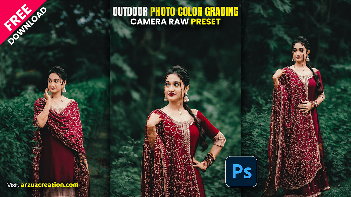
Camera Raw Presets: Outdoor Photo Color Grading

Therefore, Color grading outdoor photos in Adobe Camera Raw (ACR) is all about managing natural light, separating your subject from the background, and creating a cohesive color story (like a warm golden hour vibe or a moody, cool forest look).
Therefore, to achieve professional outdoor grading, follow this targeted workflow.
Camera Raw Presets: Outdoor Photo Color Grading,
The Outdoor Color Grading Workflow:
1. Establish Your Base Tone: Basic Panel.
Therefore, before introducing stylistic colors, fix the foundations. For outdoor shots:
White Balance: Keep it natural. Push slightly warmer for golden hour, or slightly cooler for overcast/moody landscapes.
Dehaze: Therefore, add a touch (+5 to +10) if shooting into the sun to regain lost contrast, or lower it (5) to introduce a soft, dreamy atmosphere.
Highlights & Shadows: Pull Highlights down to preserve sky detail, and open up Shadows slightly to reveal details hidden in trees or landscape geometry.
2. Target Outdoor Tones via Mixer: Color Mixer Panel.
Therefore, this is where you control nature’s primary colors (Greens, Blues, and Yellows/Oranges for skin tones). Shift to the Hue tab:
Greens: Nature’s greens can often look harsh and neon. Shift the Green slider toward Yellow (for a warm, autumnal feel) or toward Aqua (for a deep, cinematic forest look).
Yellows: Shift toward Orange to give foliage and sunlight a richer, golden tone.
Blues: Shift your sky blues slightly toward Aqua for a modern, teal-and-orange aesthetic.
Tip: Therefore, go to Saturation and lower the Green saturation slightly—muted greens make outdoor portraits look instantly more expensive.
Camera Raw Presets: Outdoor Photo Color Grading,
3. Apply the Global Grade: Color Grading Panel.
In other words, this panel uses three-way color wheels to inject distinct hues into your Highlights, Midtones, and Shadows.
Shadows: Drag the center point toward Teal/Blue. This cools down the darker parts of your image (like shadows under trees or rocks), which provides beautiful contrast against sunlight.
Highlights: In other words, drag the center point toward Orange/Gold. This warms up the sky, highlights the skin, and sunlit areas.
Midtones: Keep these close to neutral or push slightly toward Orange to maintain healthy skin tones.
4. Blend and Balance: Fine-Tuning Controls.
In other words, scroll to the bottom of the Color Grading panel to adjust how your colors interact:
Blending: Push this up toward 70-80 to allow the warm highlights and cool shadows to overlap smoothly without creating harsh edges.
Balance: If the image feels too cold, slide the Balance to the right to let the warm Highlights dominate. If it feels too muddy, slide it left to favor the clean, cool Shadows.
💡 Two Professional Tricks for Outdoors
1. The “Pop” Technique (Calibration Panel)
In other words, scroll down to the absolute bottom panel: Calibration. This panel shifts the foundational color map of your camera sensor. For outdoor photos, go to Blue Primary and shift the Hue slider slightly to the left (towards Aqua/Teal), then boost its Saturation (+10 to +20). This instantly creates a rich, cinematic separation between landscape greens and skin tones.
Camera Raw Presets: Outdoor Photo Color Grading,
2. Isolate Your Subject (AI Masking)
However, don’t let your landscape color grade muddy your subject.
- However, Press M to open Masking and click Select Subject.
- Above all, Invert the mask (or select Background instead).
- However, Apply your deep greens, cool blues, or heavy grading only to the background environment, leaving your subject clean, bright, and true-to-color so they pop off the screen.
